If a picture is worth a thousand words, data visualization is worth a thousand data points.
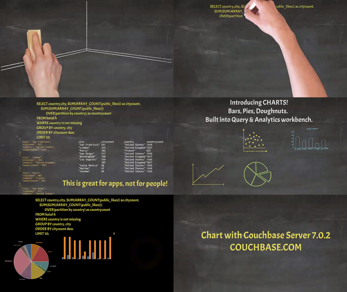
With the release of Couchbase 7.0.2, the Query Workbench (and the Analytics Workbench) now include a Charts tab that allows you to create charts and other data visualizations based on the results of a given query.
A Closer Look at Charts
Internally, we use D3.js to render the charts themselves. Each individual value can be seen using the hover tooltip, and the legend (colors and what they represent) for the multi-colored charts are seen in the right hand corner of the canvas.
The data visualization charts can also be downloaded as an SVG using the button on the right-hand side of the canvas. Sizing the canvas or the screen itself auto adjusts the charts to fit.
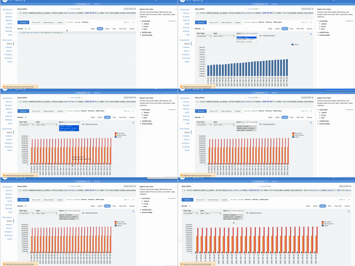
Here is a GIF of how simple it is to get started with charts while using the query workbench:
The Charts tab supports eight different types of charts:
- Scatter Gather
- Connected Scatter
- Line
- Area
- Bar
- Grouped Bar
- Pie
- Donut
Scatter Chart
Scatter charts include standard X-Y charting with the ability to visualize data by color. This chart allows you to look at the relationship between two values and group data-points using a third value, basically like a correlation. Scatter charts are dots that represent individual pieces of data.
Let’s say we have some rainfall data for a particular area in Northern California. Our dataset includes the precipitation, the day of the water year, the date in general, and the recorded rainfall for that day.
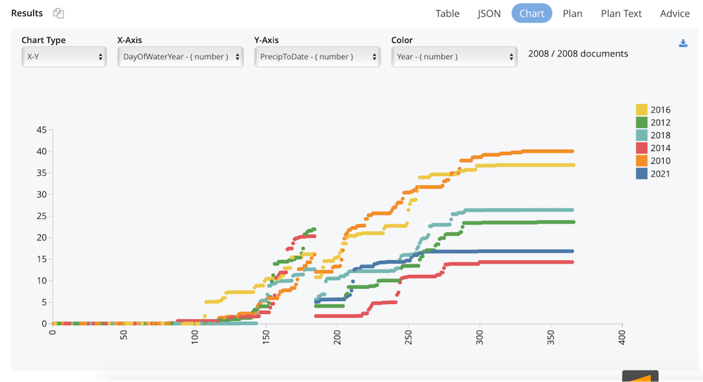
In the chart below we show the rainfall precipitation per year for the last five years.
|
1 |
select DayOfWaterYear,PrecipToDate,Year from rainfall_data where Year in [2010,2012,2014,2016,2018,2021]; |
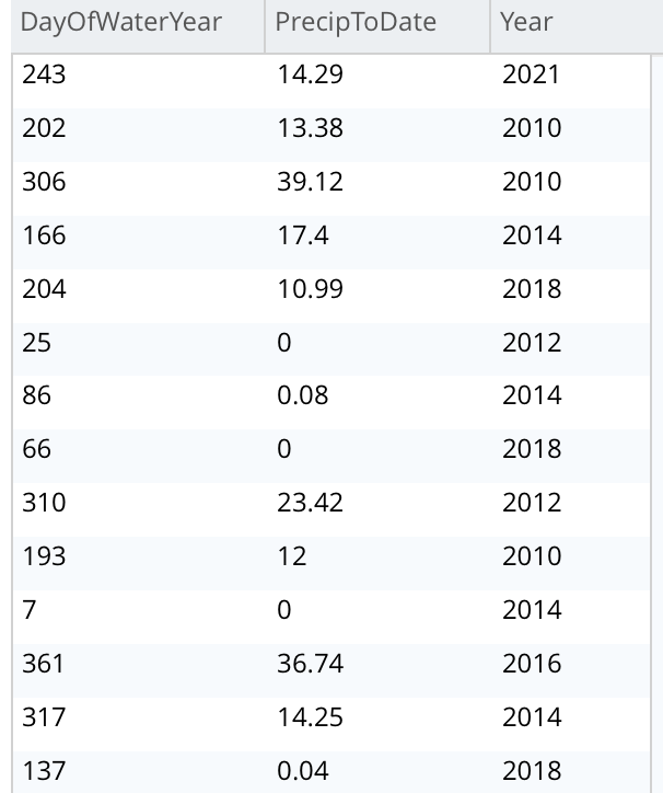
Let’s first look at a simple, tabular representation of this data.
When plotting this as a chart we get the following:
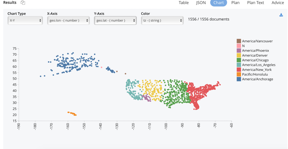
Another fun example we can look at is plotting the geo data from our travel-sample bucket and plotting all the airports in the United States.
|
1 |
select * from `travel-sample` where type = 'airport' and country = "United States"; |
We can see the data grouped by time zones so neatly that it gives us a map of the USA. We can also see any discrepancies in the data easily when visualizing it using charts. Here, we see a random data point for time zone N that I introduced as an erroneous data point.
These kinds of charts are useful when you’re trying to identify the extent of correlation between two values. Using the gather feature, you can group data points based on color. This can show you if there are any unexpected gaps in the data or if there are any outlier points. This can be useful if you want to segment the data into different parts, like in the development of user personas.
When we have lots of data points to plot, it can run into the issue of overplotting.
Connected Scatter Chart
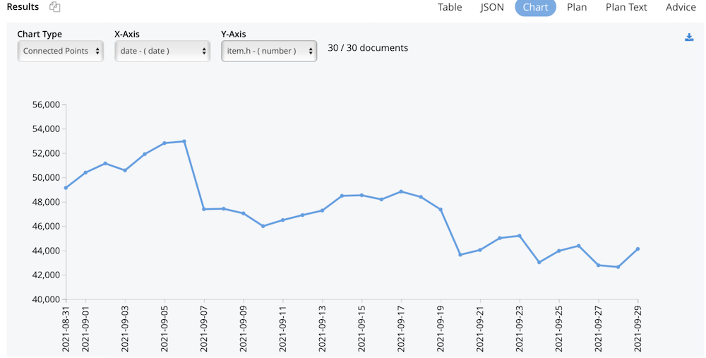
Similar to the line chart, the connected scatter chart displays the evolution or trend of a given numeric value over another value usually representing an interval of time, while also displaying the individual data points. It allows you to visualize the type or relationship or the trend, whether it’s linear or exponential, etc.
As an example, let’s look at the cryptocurrency market, namely Bitcoins and see how the trend is for the high values for the month of September using the Polygon IO API.
|
1 |
select millis_to_str(item.t,"2021-07-21") as date, item from curl("https://api.polygon.io/v2/aggs/ticker/X:BTCUSD/range/1/day/2021-09-01/2021-09-30?adjusted=true&sort=asc&apiKey=<key>") as res unnest res.results as item; |
In this example, we use unnest to flatten the nested results returned from the API.
Line Chart
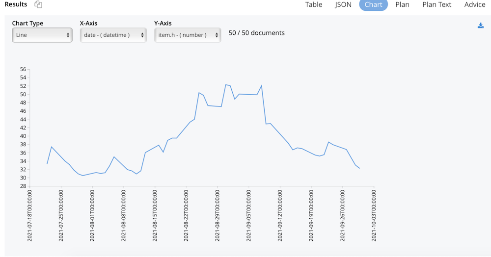
The line chart is a data visualization that displays the evolution of a numeric value over another value, usually that of time.
Let’s see how Couchbase stock has been faring since its IPO in July.
|
1 2 |
select millis_to_str(item.t,"2021-07-21T21:00:00") as date, item from curl("https://api.polygon.io/v2/aggs/ticker/BASE/range/1/day/2021-07-22/2021-09-21?apiKey=<key>") res unnest res.results as item |
Line graphs are used to track changes over short and long periods of time. When smaller changes exist, line graphs are better to use than bar graphs. Line graphs can also be used to compare changes over the same period of time for more than one group.
Area Chart
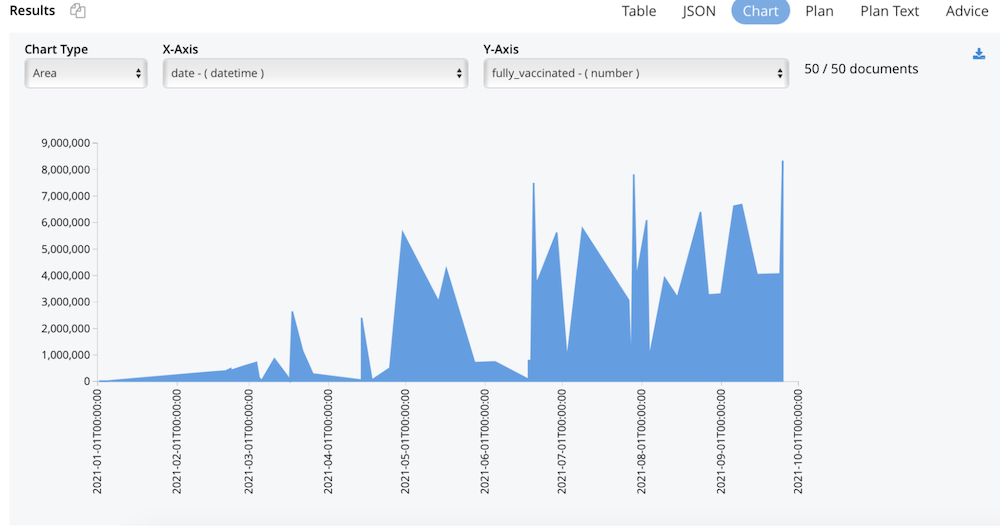
Area charts are very similar to line and bar charts, in that they combine a line and bar chart to show how numeric values change over time (or the value used). Area charts give you a distribution in your data visualization.
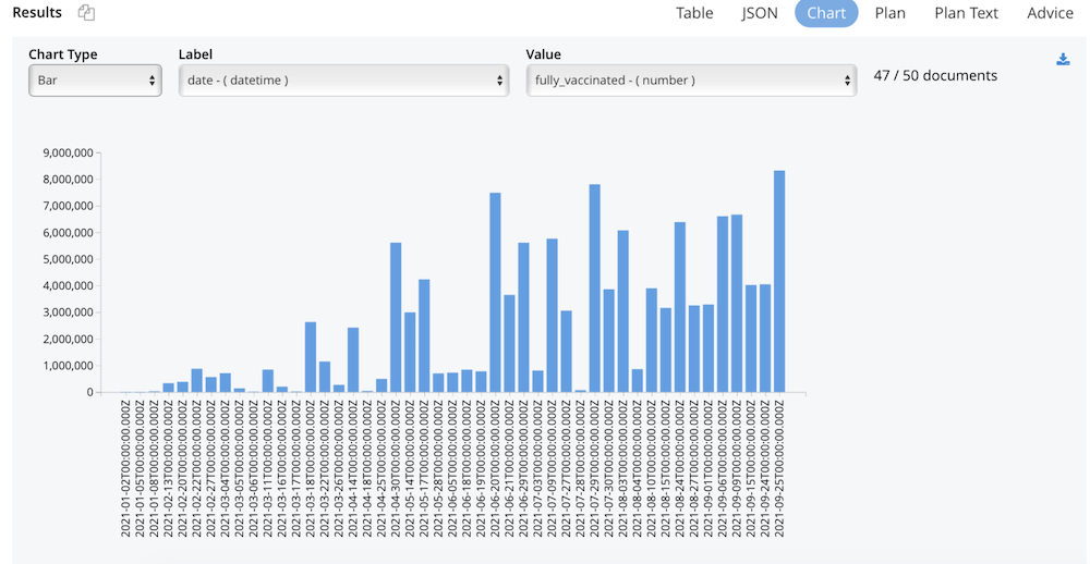
For this example, let’s work with some COVID-19 data for California. Let’s take a look at some vaccination statistics for the year 2021.
|
1 |
select * from covid_data.state.demographics where date_part_str(date,"year") = 2021 limit 50; |
Bar Charts & Grouped Bar Charts
Bar charts are used to visualize data that is categorical with rectangular bars with heights proportional to the values they represent.
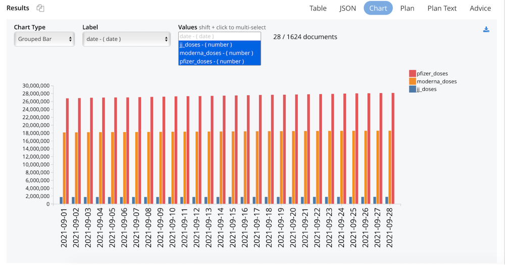
When you want to compare multiple values against the same base (usually that of time) then use a grouped bar chart. Bar graphs are especially useful when the changes over time are larger.
First, let’s plot the same data from the area chart above as a bar chart.
Now let’s compare which vaccine types were most popular per county in the month of September: Moderna, Pfizer, or Jansen?
|
1 |
select moderna_doses,jj_doses, pfizer_doses,date_format_str(date,"2020-09-09") as date from covid_data.county.vaccinations where date_part_str(date,"year") = 2021 and date_part_str(date,"month") in [9] |
An important point to note with the bar and grouped bar charts, is if the difference between the smallest and largest value being plotted is high, then the smaller values are plotted as 0 (without a bar).
Eventually this feature will add support for a logarithmic scale to plot values that range widely.
Donut Charts & Pie Charts
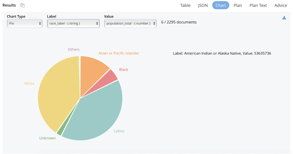
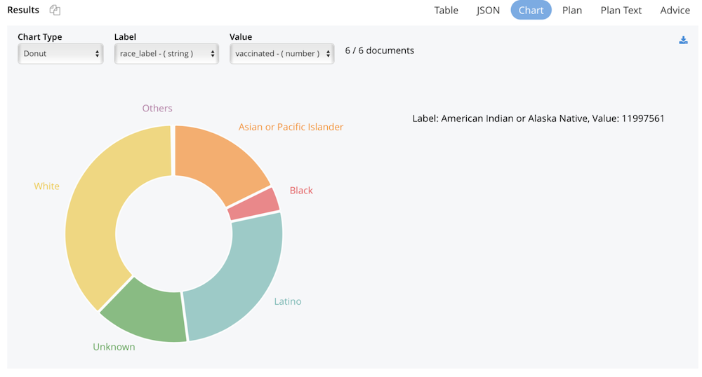
Donut and pie charts represent a part of a whole. They break down the total data into chunks based on the numeric values that you pass in.
The difference between donut and pie charts is mostly cosmetic. If you prefer to look at the parts as a pie then choose the pie charts. For these charts, the lowest 3% of data will be grouped into others and displayed as a list on the side of the Canvas.
From our COVID-19 vaccination data, let’s look at the population distribution demographics.
|
1 |
select population_total, race_label from covid_data.state.demographics; |
To see the donut chart, let’s see the number of fully vaccinated demographics.
|
1 |
select sum(fully_vaccinated) as vaccinated, race_label from covid_data.state.demographics group by race_label; |
Immediate data visualization of charts in the tabs on the query workbench make it easy for you to gain insight into your data immediately.
Summary of Features
The new Charts capabilities include all of the following:
- The X axis takes a numeric or
date,time, ortimestampvalue. - Date, times and timestamps supported formats include ISO8601.
2021-09-21T05:04:55.9992021-09-21T05:04:552021-09-21 05:04:55.9992021-09-21 05:04:552021-09-21
- The Y axis must be numeric.
- The gather-by-color option takes any value that is then used to group the data.
- For pie/donut, bar/grouped bar charts, the values must always be numeric. The labels take numeric, dates, times, timestamps (in a specific format), and ordinals.
- Geo (GIS) data can be plotted using X-Y charts (as seen in the travel-sample example).
- Hover capability.
- Download and share charts as an SVG.
Future Work
Additional types of Charts we plan to support include:
- Multi-line charts
- Multiple charts on the same canvas
- Maps
- Stacked and percentage bar plots
- Bidirectional bar charts
- Histograms
- Bubble Plots
- Density Maps
- Spaghetti Charts
- Heat Maps
We also plan to support ordinals on the chart axis and support more date, time and timestamp formats.
